 Image 1 of


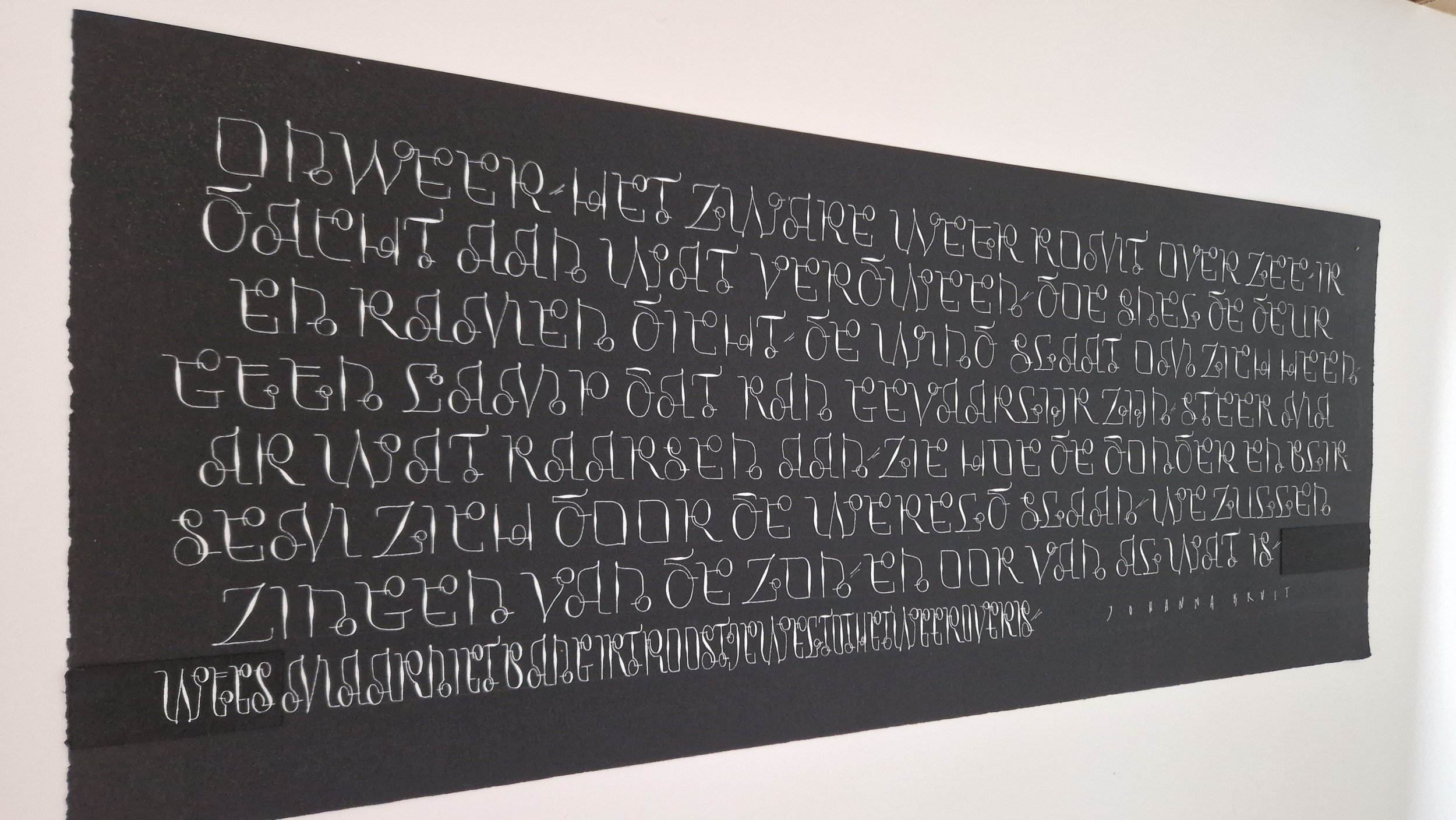
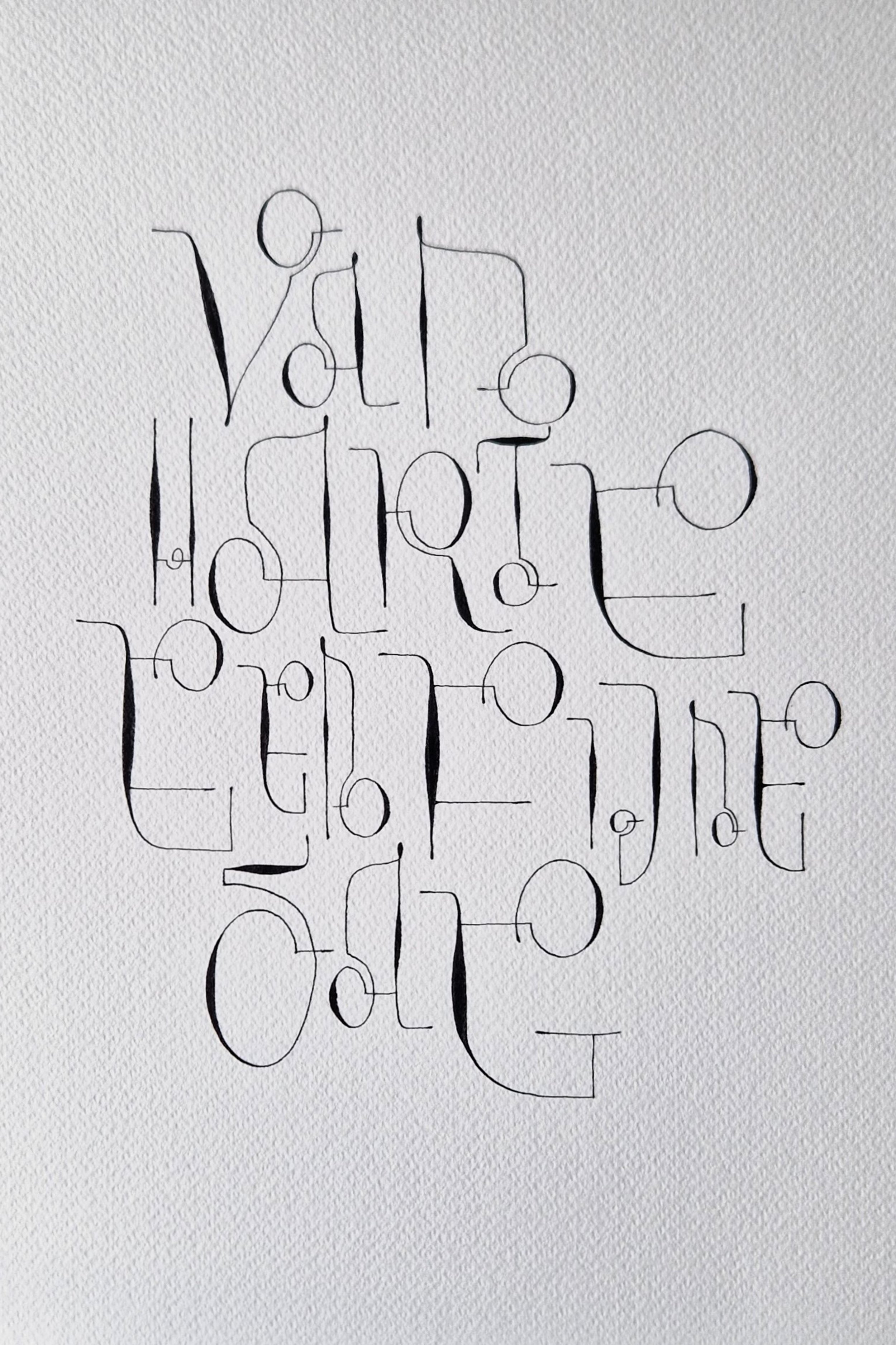
AN VAN HENTENRJIK | Troost/Solace & Een fijne dag/A fine day (Julietta script)
ARTIST | An Vanhentenrjik
BASED IN | Belgium
TITLE | Troost/Solace & Een fijne dag/A fine day (Julietta script)
SIZE | 760 x 315 mm
This text was written in a new script I just developed using the pointed pen. This is something I love to do, and hope to do more of in the future. I started to design this script to keep myself from dark thoughts while my daughter was ill (she is well-recovered now). I named the script ‘Julietta’ after her. To develop the script, I began with four concepts: 'circle', 'contrast', 'pressure & release' and 'single line'. Starting with the letter 'a', I soon had the entire alphabet. It wasn’t easy because the letter shapes are very different from the usual capital letters. Then I wrote this large text about solace with bleedproof white on black Velin d'ARCHES paper.
MEDIUM | Velin d'ARCHES paper, bleedproof white
PRICE | Not for sale.
About the artist

An Vanhentenrjik started calligraphy in 1988/1989, and became a professional calligrapher in 1996. She has been teaching calligraphy for 30 years, an occupation which she loves. Through this, she has impacted the development of calligraphy in the Flanders. In 2001, she created her first paper bowl, and has not stopped making these iconic, collectible pieces. In 2007, she designed the organic Kalliandra script, written with the pointed pen. In 2018, she won the prestigious calligraphy competition ‘De Grote prijs Kalligrafie 2018 in Westerlo/Belgium’. In 2023, An created the Juliette script and named it after her daughter. In recent years, An is focusing on her personal calligraphy work and hopes to create more alphabets. In recent years she has exhibited several times in Belgium. Her works were also published in calligraphy magazines such as Scriptores, Letter Arts Review, and The Edge (UK). Many of her works are owned by museums and private collectors.


