


This butterfly is probably the most colourful of the trio, with green, red, purple and gold tones. They’re most obvious when viewed head on with direct light. It was quite hard to decide on the inking colours for this butterfly as it was the middle one, and she wanted tones that would tie in with both the first and third pieces.

Here is where the colourshift is the most different. The green, red and bronze tones before have shifted entirely into different hues of blue and purple, and the gold/bronze which previously was warmer tone, is now a cool toned gold which has a greenish tinge.
As the light source dims and shifts, the colourshift begins. The set of top wings has more purple and blue tones. The gold flowers near the head and body of the butterfly are also inked in the same colour as the bronze flourishes on the bottom wings – a slight difference in lighting enables you to see both colours at once.

She picked colours that are best viewed in unconventional lighting because she wanted the viewing experience to require time and attention, for it is only then that the viewer would be able to see the full spectrum of colours. She felt that is the best way to not just view art, but also the experiences we have. We never know if a bit of time and attention will reveal things you didn’t know were there before.
About the artist
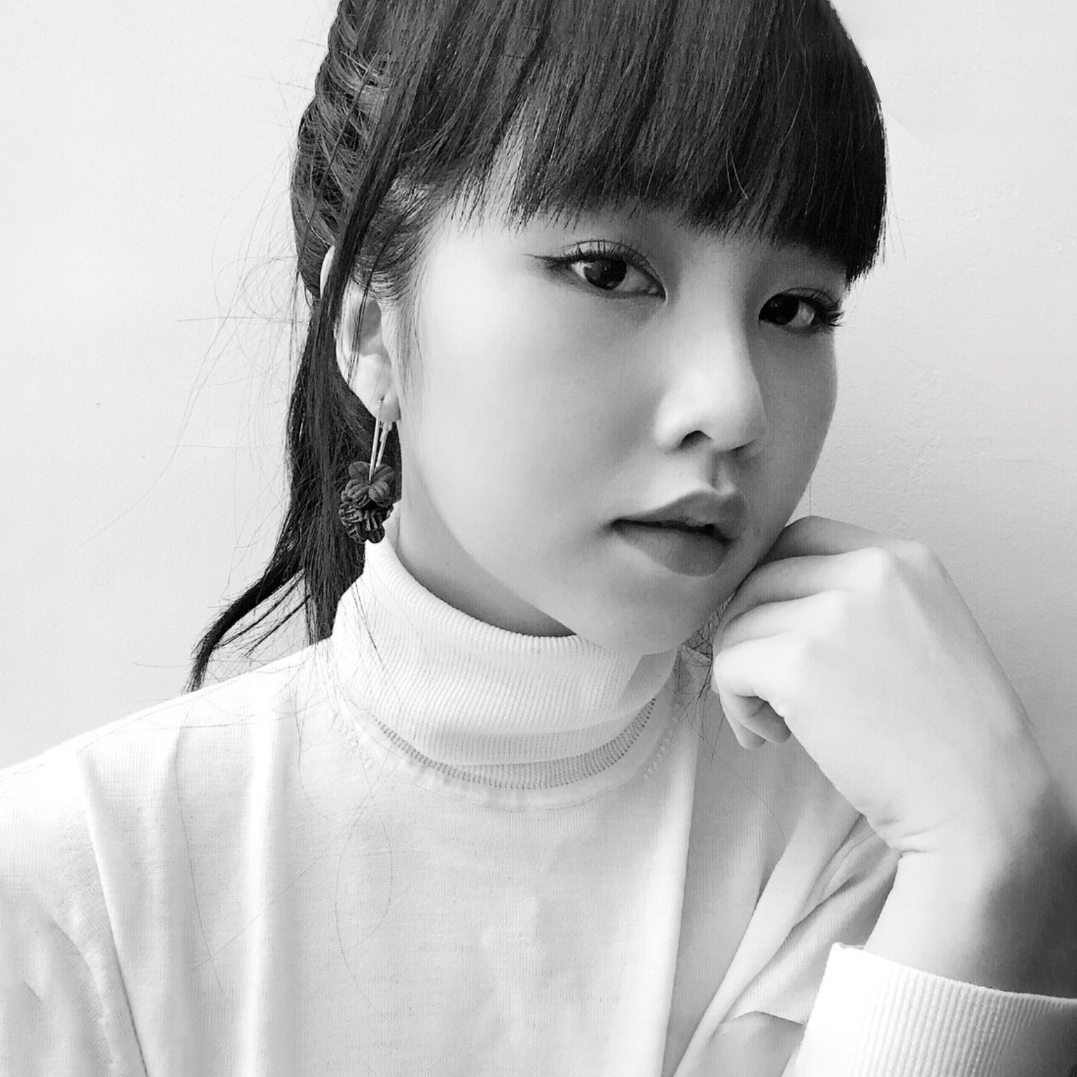
A writer and aesthete at heart, Rachel has always been in love with words. Rachel’s love for calligraphy started from a hobby discovered in 2016. Charmed by the slow & mindful writing process required by the dip pen and the rich history behind the craft, her interests grew to include scripts in traditional scripts with modern applications, flourishing, illustrations, watercolour botanicals, and more recently, engraving. Distinctive of her work is the combination of modern whimsy with the elegance and timelessness of traditional calligraphy. Rachel’s love for the art of writing grew, and the year that she took off work in 2018 to venture into calligraphy full time eventually turned into four.
Rachel’s instagram moniker “phosphenes”, referring to lights behind closed eyes, gives a clue about her approach to art. To her, phosphenes are associated with the imagination. What she creates comes from the wellspring of her imagination, and is also inspired by the play of light and colour, which stems from her interest in the impressionist art movement.